Content blocks
Aris comes with many content blocks (or designed blocks) which helps you to present your data/information in pages, blog post or any places you want to.
Alert
Type declaration
type AlertProps = {
alertType?: AlertTagColor
alignment?: "left" | "right"
className?: string
hasShadow?: boolean
children: React.ReactNode
/**
* make your alert looks `art` when skew to the left or to the right
*/
art?: "right" | "left"
}
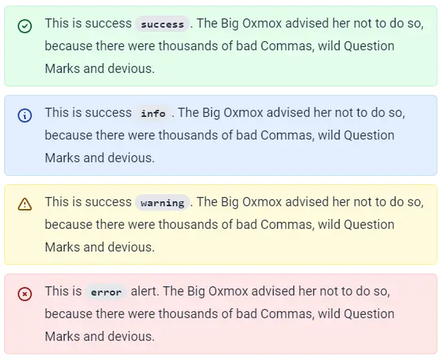
type AlertTagColor = number | "gray" | "blue" | "red" | "yellow" | "green" | "random" | "info" | "success" | "warning" | "error"
- Usage
- Screenshots
import Alert from "~/components/Alert"

<Alert alertType="warning">
  Lorem ipsum dolor sit amet, consectetur adip locales justifying information
</Alert>
Align
Type declaration
type AlignProps = {
  alignment?: "left" | "right" | "2Columns" | "expanded"
  className?: string
  children: React.ReactNode
}
- Usage
- Screenshots
import Align from "~/components/Align"
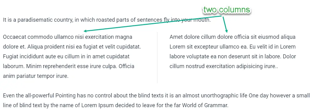
<Align alignment="2Columns">
Occaecat commodo ullamco nisi exercitation magna dolore et. Aliqua proident nisi ea fugiat et velit cupidatat. Fugiat incididunt aute eu cillum in in amet cupidatat laborum. Minim reprehenderit esse irure culpa. Officia anim pariatur tempor irure.
Amet dolore cillum dolore officia sit eiusmod aliqua Lorem sit excepteur ullamco ea. Eu velit id in Lorem labore voluptate ea non deserunt sit in labore. Dolor cillum nostrud exercitation adipisicing irure..
</Align>
Facts
Type declaration
type FactsProps = {
  facts: FactsGroup
  langTable: LangTable
}

type FactsGroup = {
  title?: string
  description?: string
  facts: FactItem[]
}

type FactItem = {
  quantity: number,
  title: string
  imageUrl?: string
}
- Usage
- Data
- Note
- Screenshots
import Facts from "~/components/Facts"

<Facts
  facts={factsInAbout}
  langTable={factsLangTable}
/>
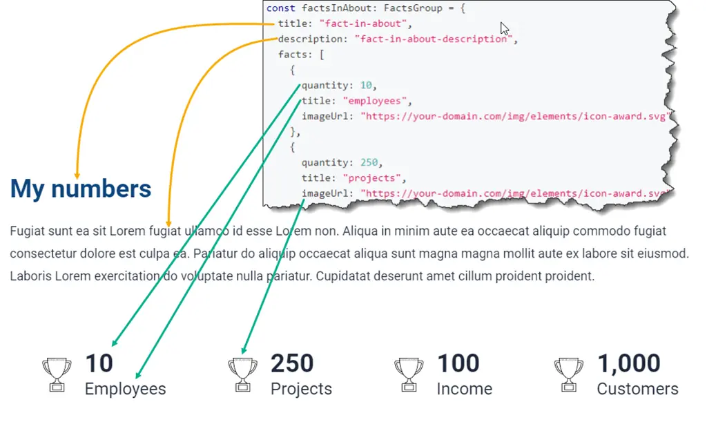
export const factsInAbout: FactsGroup = {
  title: "fact-in-about",
  description: "fact-in-about-description",
  facts: [
    {
      quantity: 10,
      title: "employees",
      imageUrl: "https://your-domain.com/img/elements/icon-award.svg"
    },
    {
      quantity: 250,
      title: "projects",
      imageUrl: "https://your-domain.com/img/elements/icon-award.svg"
    },
    {
      quantity: 100,
      title: "income",
      imageUrl: "https://your-domain.com/img/elements/icon-award.svg"
    },
    {
      quantity: 1000,
      title: "customers",
      imageUrl: "https://your-domain.com/img/elements/icon-award.svg"
    }
  ]
}
If you don't use translation, just remove langTable property.
<Facts
  facts={factsInAbout}  //just remove this line
  langTable={factsLangTable}
/>
FaqsBlock
Type declaration
type FaqsBlockProps = {
  faqs: FAQs[],
  langTable: LangTable
  /**
   * if FaqsBlock is `standalone`, it only display list of questions and answers
   * without `title` and `description`
   */
  standalone?: boolean
}

type FAQs = {
  question: string
  answer: string
  expanded?: boolean
  additional?: {
    question?: string[]
    answer?: string[]
  }
}
- Usage
- Data
- Note
- Screenshots
import FaqsBlock from "~/components/Faqs"

<FaqsBlock
  langTable={faqsServicesLangTable}
  faqs={faqsServices}
/>
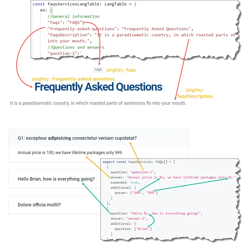
export const faqsServices: FAQs[] = [
  {
    question: "question-1",
    answer: "Annual price is %s, we have lifetime packages only %s.",
    expanded: true,
    additional: {
      answer: ["100", "999"]
    }
  },
  {
    question: "Hello %s, how is everything going?",
    answer: "answer-2",
    additional: {
      question: ["Brian"]
    }
  },
  {
    question: "question-3",
    answer: "answer-3"
  },
]
If you don't use translation, just remove langTable property and add standalone property.
<FaqsBlock
  langTable={faqsServicesLangTable}  //just remove this line
  faqs={faqsServices}
  standalone  //add this line
/>
Features
Features.Simplicity
Type declaration
type FeaturesSimplicityProps = {
  features: TFeatures
  langTable: LangTable
}
- Usage
- Data
- Note
- Screenshots
import Features from "~/components/Features"

<Features.Simplicity
  features={mySkills}
  langTable={skillsLangTable}
/>
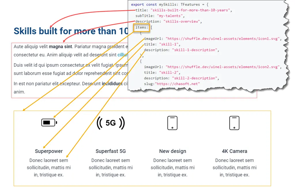
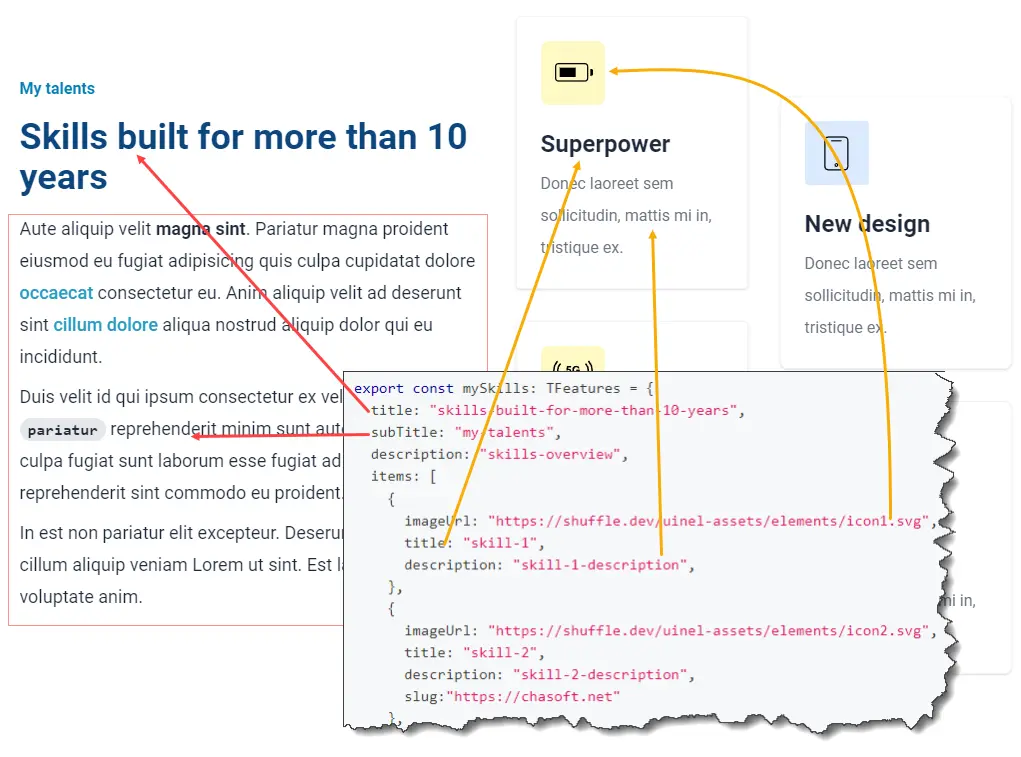
export const mySkills: TFeatures = {
  title: "skills-built-for-more-than-10-years",
  subTitle: "my-talents",
  description: "skills-overview",
  items: [
    {
      imageUrl: "https://shuffle.dev/uinel-assets/elements/icon1.svg",
      title: "skill-1",
      description: "skill-1-description",
    },
    {
      imageUrl: "https://shuffle.dev/uinel-assets/elements/icon2.svg",
      title: "skill-2",
      description: "skill-2-description",
      slug:"https://chasoft.net"
    },
    {
      imageUrl: "https://shuffle.dev/uinel-assets/elements/icon3.svg",
      title: "skill-3",
      description: "skill-3-description",
      slug:"/contact"
    },
    {
      imageUrl: "https://shuffle.dev/uinel-assets/elements/icon3.svg",
      title: "skill-4",
      description: "skill-4-description",
    }
  ]
}
notes...
Features.Blocks
Type declaration
type FeaturesBlocksProps = {
  features: TFeatures
  langTable: LangTable
}
- Usage
- Data
- Note
- Screenshots
import Features from "~/components/Features"

<Features.Blocks
  features={mySkills}
  langTable={skillsLangTable}
/>
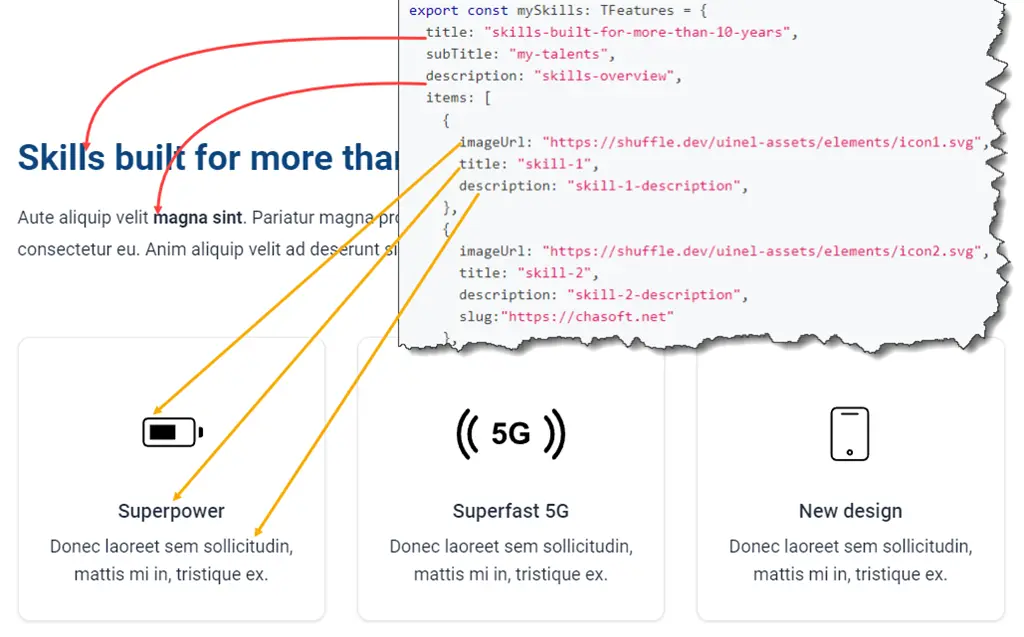
export const mySkills: TFeatures = {
  title: "skills-built-for-more-than-10-years",
  subTitle: "my-talents",
  description: "skills-overview",
  items: [
    {
      imageUrl: "https://shuffle.dev/uinel-assets/elements/icon1.svg",
      title: "skill-1",
      description: "skill-1-description",
    },
    {
      imageUrl: "https://shuffle.dev/uinel-assets/elements/icon2.svg",
      title: "skill-2",
      description: "skill-2-description",
      slug:"https://chasoft.net"
    },
    {
      imageUrl: "https://shuffle.dev/uinel-assets/elements/icon3.svg",
      title: "skill-3",
      description: "skill-3-description",
      slug:"/contact"
    },
    {
      imageUrl: "https://shuffle.dev/uinel-assets/elements/icon3.svg",
      title: "skill-4",
      description: "skill-4-description",
    }
  ]
}
notes...
Features.Picture
Type declaration
type FeaturesPictureProps = {
  features: TFeatures
  langTable: LangTable
  /**
   * swap `left to right` and `right to left`
   */
  reverse?: boolean
}
- Usage
- Data
- Note
- Screenshots
import Features from "~/components/Features"

<Features.Picture
  features={mySkills}
  langTable={skillsLangTable}
/>
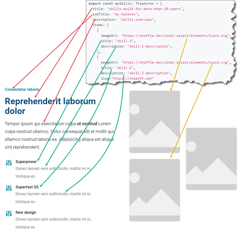
export const mySkills: TFeatures = {
  title: "skills-built-for-more-than-10-years",
  subTitle: "my-talents",
  description: "skills-overview",
  items: [
    {
      imageUrl: "https://shuffle.dev/uinel-assets/elements/icon1.svg",
      title: "skill-1",
      description: "skill-1-description",
    },
    {
      imageUrl: "https://shuffle.dev/uinel-assets/elements/icon2.svg",
      title: "skill-2",
      description: "skill-2-description",
      slug:"https://chasoft.net"
    },
    {
      imageUrl: "https://shuffle.dev/uinel-assets/elements/icon3.svg",
      title: "skill-3",
      description: "skill-3-description",
      slug:"/contact"
    },
    {
      imageUrl: "https://shuffle.dev/uinel-assets/elements/icon3.svg",
      title: "skill-4",
      description: "skill-4-description",
    }
  ]
}
notes...
Features.Art
Type declaration
type FeaturesArtProps = {
  features: TFeatures
  langTable: LangTable
  /**
   * swap
   */
  reverse?: boolean
}
- Usage
- Data
- Note
- Screenshots
import Features from "~/components/Features"

<Features.Art
  features={mySkills}
  langTable={skillsLangTable}
/>
export const mySkills: TFeatures = {
  title: "skills-built-for-more-than-10-years",
  subTitle: "my-talents",
  description: "skills-overview",
  items: [
    {
      imageUrl: "https://shuffle.dev/uinel-assets/elements/icon1.svg",
      title: "skill-1",
      description: "skill-1-description",
    },
    {
      imageUrl: "https://shuffle.dev/uinel-assets/elements/icon2.svg",
      title: "skill-2",
      description: "skill-2-description",
      slug:"https://chasoft.net"
    },
    {
      imageUrl: "https://shuffle.dev/uinel-assets/elements/icon3.svg",
      title: "skill-3",
      description: "skill-3-description",
      slug:"/contact"
    },
    {
      imageUrl: "https://shuffle.dev/uinel-assets/elements/icon3.svg",
      title: "skill-4",
      description: "skill-4-description",
    }
  ]
}
notes...
Highlight
Type declaration
type HighlightProps = {
  /**
   * background color
   */
  color?: string,
  /**
   * text color
   */
  text?: string,
  children: React.ReactNode
}
- Usage
- Screenshots
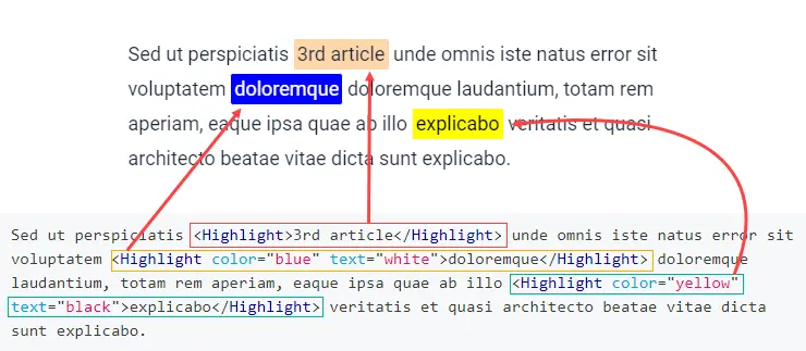
import Highlight from "~/components/Highlight"

<Highlight>3rd article</Highlight>

<Highlight color="blue" text="white">
  3rd article
</Highlight>
Sed ut perspiciatis <Highlight>3rd article</Highlight> unde omnis iste natus error sit voluptatem <Highlight color="blue" text="white">doloremque</Highlight> doloremque laudantium, totam rem aperiam, eaque ipsa quae ab illo <Highlight color="yellow" text="black">explicabo</Highlight> veritatis et quasi architecto beatae vitae dicta sunt explicabo.
Image
Display a image based on screen size. mobile for screen size >= 640px. desktop for screen size > 640px.
Type declaration
type ImageProps = JSX.IntrinsicElements["img"] & {
  srcList: ImgSrcSet,
  rounded?: "sm" | "md" | "lg" | "xl" | "2xl"
  wfull?: boolean,
  hfull?: boolean
}

type ImgSrcSet = {
  mobile: string
  desktop?: string
  description?: string
}
- Usage
- Data
- Note
import Image from "~/components/Image"

<Image
  srcList={image}
  className="bg-slate-100 w-full"
  alt=""
/>
export const image = {
  mobile: "/img/background/image1.jpg",
  desktop: "/img/background/image2.jpg",
  description: "image 1"
}
This component is flexible for it is extended from img tag and it can receive styles properties
LatestBlogPosts
Type declaration
type LatestBlogPostsProps = {
  showTitle?: boolean
  display?: Display
  /**
   * max is 6
   */
  limit?: number,
  showAsColumn?: boolean
}
- Usage
- Screenshots
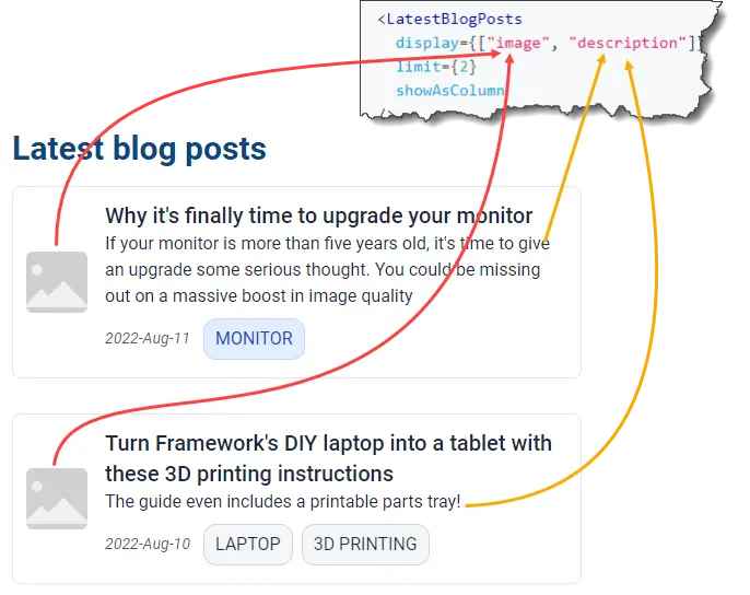
import LatestBlogPosts from "~/components/LatestBlogPosts"

<LatestBlogPosts
  display={["image", "description"]}
  limit={2}
  showAsColumn
/>
LatestContent
You can extract and display latest update by block or by link
Type declaration
/**
 *  LatestContent.Note
 *  LatestContent.Update
 *  LatestContent.Announcement
 */
type LatestBlockProps = { alignment?: "left" | "right" }

/**
 *  LatestContent.NotesLink
 *  LatestContent.UpdateLink
 *  LatestContent.AnnouncementLink
 */
type LatestLinkProps = {/* empty */}
- Usage
- Screenshots
import LatestContent from "~/components/LatestContent"

<LatestContent.Note />
<LatestContent.Update />
<LatestContent.Announcement />

<LatestContent.NotesLink />
<LatestContent.AnnouncementLink />
<LatestContent.UpdateLink />
View latest announcement <LatestContent.AnnouncementLink /> for details.

LatestPortfolio {#latest-portfolio}}
Type declaration
type LatestPortfolioProps = {
  showTitle?: boolean
  display?: Display
  limit?: number
}
- Usage
- Screenshots
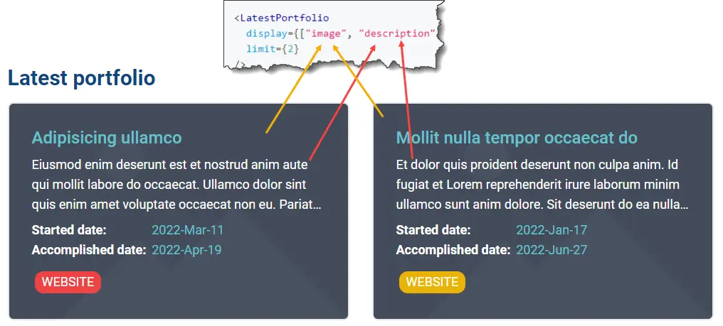
import LatestPortfolio from "~/components/LatestPortfolio"

<LatestPortfolio
  display={["image", "description"]}
  limit={2}
/>
Link
If you want a link, let you use Link component. Or if the target is internal links, you must use this component, or multi-language feature not working.
Type declaration
type LinkProps = {
  to: string
  className?: string
  children: string
}
- Usage
import Link from "~/components/Link"

<Link to="/blog">Blog</Link>
LinksGrid
Type declaration
type LinksGridProps = {
  links: LinkMeta[]
  className?: string
}

type LinkMeta = {
  /**
   * if you set a type for a link
   * we will show an icon for the link (default icon)
   * if you don't set imageUrl.
   */
  type?: LinkMetaType
  title: string,
  description?: string
  slug: string,
  iconPicture?: string,
  decoration?: {
    /**
     * we will fill gradient the background
     * 1st & 2nd is background gradient
     * 3rd is text-color
     */
    backgroundColor?: [string, string, string]
    isTextCenter?: boolean
    isBold?: boolean
    isItalic?: boolean
    isDownloadable?: boolean
  }
}
- Usage
- Data
- Note
- Screenshots
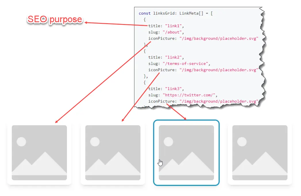
imort LinksGrid from "~/components/LinksGrid"

<LinksGrid links={linksGrid} />
export const linksGrid: LinkMeta[] = [
  {
    title: "link1",
    slug: "/about",
    iconPicture: "/img/background/placeholder.svg"
  },
  {
    title: "link2",
    slug: "/terms-of-service",
    iconPicture: "/img/background/placeholder.svg"
  },
  {
    title: "link3",
    slug: "https://twitter.com/",
    iconPicture: "/img/background/placeholder.svg"
  },
  {
    title: "link4",
    slug: "/contact",
    iconPicture: "/img/background/placeholder.svg",
  }
]
notes...
LinksList
Type declaration
type LinksListProps = {
  links: LinkMeta[]
  className?: string
}

type LinkMeta = {
  /**
   * if you set a type for a link
   * we will show an icon for the link (default icon)
   * if you don't set imageUrl.
   */
  type?: LinkMetaType
  title: string,
  description?: string
  slug: string,
  iconPicture?: string,
  decoration?: {
    /**
     * we will fill gradient the background
     * 1st & 2nd is background gradient
     * 3rd is text-color
     */
    backgroundColor?: [string, string, string]
    isTextCenter?: boolean
    isBold?: boolean
    isItalic?: boolean
    isDownloadable?: boolean
  }
}
- Usage
- Data
- Note
- Screenshots
import LinksList from "~/components/LinksList"

<LinksList links={linksList}/>
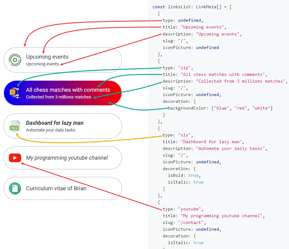
export const linksList: LinkMeta[] = [
  {
    type: undefined,
    title: "Upcoming events",
    description: "Upcoming events",
    slug: "/",
    iconPicture: undefined
  },
  {
    type: "zip",
    title: "All chess matches with comments",
    description: "Collected from 3 millions matches",
    slug: "/",
    iconPicture: undefined,
    decoration: {
      backgroundColor: ["blue", "red", "white"]
    }
  },
  {
    type: "xls",
    title: "Dashboard for lazy man",
    description: "Automate your daily tasks",
    slug: "/",
    iconPicture: undefined,
    decoration: {
      isBold: true,
      isItalic: true
    }
  },
  {
    type: "youtube",
    title: "My programming youtube channel",
    slug: "/contact",
    iconPicture: undefined,
    decoration: {
      isItalic: true
    }
  },
  {
    type: "cv",
    title: "Curriculum vitae of Brian",
    slug: "/files/mycv.pdf",
    iconPicture: "/img/background/placeholder.svg",
    decoration: {
      isDownloadable: true
    }
  },
]
notes...
Map
Map component allows you to show a map and you can also add many custom marker. When hovering over a marker, it information would be display on the top right of the map.
Type declaration
type MapProps = {
  markers: TMarker[]
  /**
   * zoom is from `4` to `18`
   */
  defaultZoom?: number
  defaultCenter?: Point
  hasPadding?: boolean
  alignment?: "left" | "right" | "expanded"
}

export type TMarker = {
  width?: number
  color?: string
  anchor: Point
  slug?: string
  title?: string
  description?: string
  /**
   * title and description would be displayed
   * as if the marker is on hover if `isDefault` is true
   * Tip: only set 1 marker with `isDefault = true`
   */
  isDefault?: boolean
}

/**
 * [latitude, longitude]
 */
export type Point = [number, number]
- Usage
- Data
- Note
- Screenshots
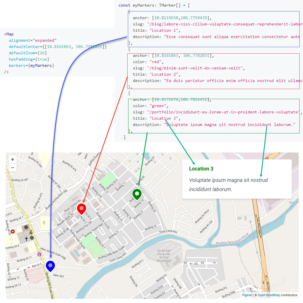
import Map from "~/components/Map"

<Map
  alignment="expanded"
  defaultCenter={[10.8161863, 106.7782831]}
  defaultZoom={16}
  hasPadding={true}
  markers={myMarkers}
/>
export const myMarkers: TMarker[] = [
    {
      anchor: [10.8119658,106.7759439],
      slug: "/blog/labore-nisi-cillum-voluptate-consequat-reprehenderit-laborum-deserunt-exercitation",
      title: "Location 1",
      description: "Esse consequat sunt aliqua exercitation consectetur aute amet et consequat velit voluptate."
    },
    {
      anchor: [10.8161863, 106.7782831],
      color: "red",
      slug: "/blog/minim-sunt-velit-do-veniam-velit",
      title: "Location 2",
      description: "Ea duis pariatur officia enim officia nostrud elit ullamco."
    },
    {
      anchor: [10.8172676,106.7824432],
      color: "green",
      slug: "/portfolio/incididunt-eu-lorem-ut-in-proident-labore-voluptate",
      title: "Location 3",
      description: "Voluptate ipsum magna sit nostrud incididunt laborum."
    },
  ]
Do not set more than 1 markers with isDefault={true} or their content would be overlapped.
Where to get the anchor values?
You can use Google Map and, select a location on the map and you will have the anchor

  anchor = [1.29105, 103.8439817]
  zoom = 17
Markdown
Type declaration
type MarkdownProps = {
  maxWidth?: "md" | "lg" | "xl"
  textSize?: "md" | "lg" | "xl"
  /**
   * by the fault, the spacing between h1, h2 & h3 is big
   * some cases, we need to decrease the spacing for
   * some inner block of text
   */
  compact?: boolean
  /**
   * split the text into 2 columns
   */
  twoColumns?: boolean,
}
- Usage
- Note
import Markdown from "~/components/Markdown"

<Markdown markdown={`
# H1

**Lorem** ipsum dolor \`sit\` amet, consectetur adipisicing elit, sed do **eiusmod** tempor incididunt ut labore.

|                |ASCII                          |HTML                         |
|----------------|-------------------------------|-----------------------------|
|Single backticks|\`'Isn't this fun?'\`            |'Isn't this fun?'            |
|Quotes          |\`"Isn't this fun?"\`            |"Isn't this fun?"            |
|Dashes          |\`-- is en-dash, --- is em-dash\`|-- is en-dash, --- is em-dash|

`}
/>
In most cases, you don't need to use any properties except markdown
<Mardown markdown="...." />
Markdown syntaxes are simple, check this guide for examples: Markdown
Picture
Display a single picture
Type declaration
type PictureProps = {
  className?: string
  alt?: string
  src: string
  alignment?: "left" | "right" | "expanded"
  rounded?: "sm" | "md" | "lg" | "xl" | "2xl"
  /**
   * By the default, when alignment is left or right, the width would be 1/2
   * Some cases, you want it to be smaller, which is 1/3
   */
  oneThird?: boolean
}
- Usage
- Note
import Picture from "~/components/Picture"

<Picture
  src="/img/background/placeholder.svg"
  alt="image's description"
  expand
/>
What are the differences between Image and Picture?
Picture display 1 single image.
Image display 1 single image based on the screen size. You can review its description for more information.
PricingTable
Type declaration is the same for all PriceTable components PricingTable.List, PricingTable.TwoColumn and PricingTable.ThreeColumn
PricingTable.List
Type declaration
type PricingTableListProps = {
  pricingData: PricingData,
  langTable: LangTable
}

type PricingData = {
  title: string
  description: string
  defaultPriceType: PricingType
  packages: PricingPackage[]
  /**
   * if this data is provided, the pricing table would have
   * a list of features listed on the left
   * by this time, the size of `featuresHeading` must equal to `packages.features`
   */
  featuresHeadering?: string[]
  currencyConversion: {
    [key in Language]: {
      ratio: number
      rounding: number
    }
  }
}

type PricingType = "fixed" | "monthly" | "yearly" | "lifetime"

type PricingPackage = {
  name: string
  pricing: { type: PricingType, value: number }[]
  features: {  featureName: string, bulletType: BulletType, quantity?: number }[]
  isPopular?: boolean
  buttonText?: string
  link: string
}

type BulletType = "none" | "available" | "unavailable"
- Usage
- Data
- Note
- Screenshots
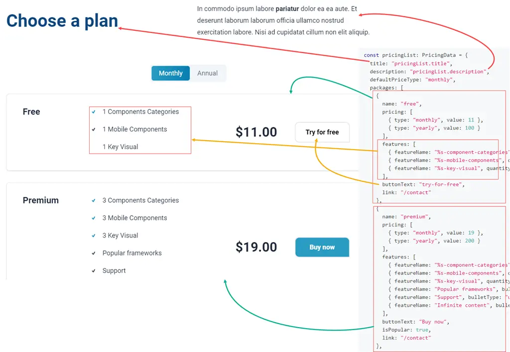
import PricingTable from "~/components/PricingTable"

<PricingTable.List
  pricingData={pricingList}
  langTable={servicesLangTable}
/>
export const pricingList: PricingData = {
  title: "pricingList.title",
  description: "pricingList.description",
  defaultPriceType: "monthly",
  packages: [
    {
      name: "free",
      pricing: [
        { type: "monthly", value: 11 },
        { type: "yearly", value: 100 }
      ],
      features: [
        { featureName: "%s-component-categories", quantity: 1,  bulletType: "available" },
        { featureName: "%s-mobile-components", quantity: 1, bulletType: "unavailable" },
        { featureName: "%s-key-visual", quantity: 1, bulletType: "none" }
      ],
      buttonText: "try-for-free",
      link: "/contact"
    },
    {
      name: "premium",
      pricing: [
        { type: "monthly", value: 19 },
        { type: "yearly", value: 200 }
      ],
      features: [
        { featureName: "%s-component-categories", quantity: 3, bulletType: "available" },
        { featureName: "%s-mobile-components", quantity: 3,bulletType: "available" },
        { featureName: "%s-key-visual", quantity: 3, bulletType: "available" },
        { featureName: "Popular frameworks", bulletType: "unavailable" },
        { featureName: "Support", bulletType: "unavailable" },
        { featureName: "Infinite content", bulletType: "unavailable" },
      ],
      buttonText: "Buy now",
      isPopular: true,
      link: "/contact"
    },
    {
      name: "basic",
      pricing: [
        { type: "monthly", value: 11 },
        { type: "yearly", value: 100 }
      ],
      features: [
        { featureName: "%s-component-categories", quantity: 3, bulletType: "available" },
        { featureName: "%s-mobile-components", quantity: 3,bulletType: "unavailable" },
        { featureName: "%s-key-visual", quantity: 3,bulletType: "none" }
      ],
      buttonText: "buy-now",
      link: "/contact",
      isPopular: false,
    },
    {
      name: "enterprise",
      pricing: [
        { type: "monthly", value: 11 },
        { type: "yearly", value: 100 }
      ],
      features: [
        { featureName: "%s-component-categories", quantity: 3, bulletType: "available" },
        { featureName: "%s-mobile-components", quantity: 3, bulletType: "available" },
        { featureName: "%s-key-visual", quantity: 3, bulletType: "none" }
      ],
      buttonText: "buy-now",
      link: "/contact",
      isPopular: false,
    }
  ],
  currencyConversion: {
    "en": {
      ratio: 1,
      rounding: 2
    },
    "vi": {
      ratio: 24_000,
      rounding: -4
    }
  }
}
notes...
PricingTable.TwoColumn
Type declaration
/* The same with `PricingTable.List` */
- Usage
- Data
- Note
- Screenshots
import PricingTable from "~/components/PricingTable"

<PricingTable.TwoColumn
  pricingData={pricing2Column}
  langTable={servicesLangTable}
/>
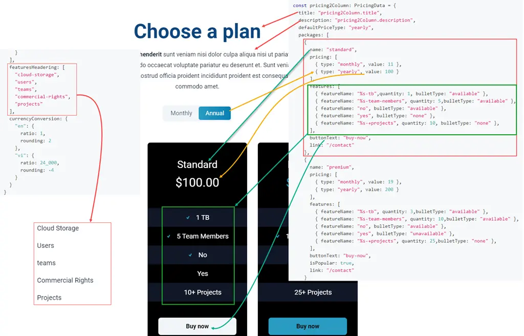
export const pricing2Column: PricingData = {
  title: "pricing2Column.title",
  description: "pricing2Column.description",
  defaultPriceType: "yearly",
  packages: [
    {
      name: "standard",
      pricing: [
        { type: "monthly", value: 11 },
        { type: "yearly", value: 100 }
      ],
      features: [
        { featureName: "%s-tb",quantity: 1, bulletType: "available" },
        { featureName: "%s-team-nembers", quantity: 5,bulletType: "available" },
        { featureName: "no", bulletType: "available" },
        { featureName: "yes", bulletType: "none" },
        { featureName: "%s-+projects", quantity: 10, bulletType: "none" },
      ],
      buttonText: "buy-now",
      link: "/contact"
    },
    {
      name: "premium",
      pricing: [
        { type: "monthly", value: 19 },
        { type: "yearly", value: 200 }
      ],
      features: [
        { featureName: "%s-tb", quantity: 3,bulletType: "available" },
        { featureName: "%s-team-members", quantity: 10,bulletType: "available" },
        { featureName: "no", bulletType: "available" },
        { featureName: "yes", bulletType: "unavailable" },
        { featureName: "%s-+projects", quantity: 25,bulletType: "none" },
      ],
      buttonText: "buy-now",
      isPopular: true,
      link: "/contact"
    }
  ],
  featuresHeadering: [
    "cloud-storage",
    "users",
    "teams",
    "commercial-rights",
    "projects"
  ],
  currencyConversion: {
    "en": {
      ratio: 1,
      rounding: 2
    },
    "vi": {
      ratio: 24_000,
      rounding: -4
    }
  }
}
notes...
PricingTable.ThreeColumn
Type declaration
/* The same with `PricingTable.List` */
- Usage
- Data
- Note
- Screenshots
import PricingTable from "~/components/PricingTable"

<PricingTable.ThreeColumn
  pricingData={pricing3Column}
  langTable={servicesLangTable}
/>
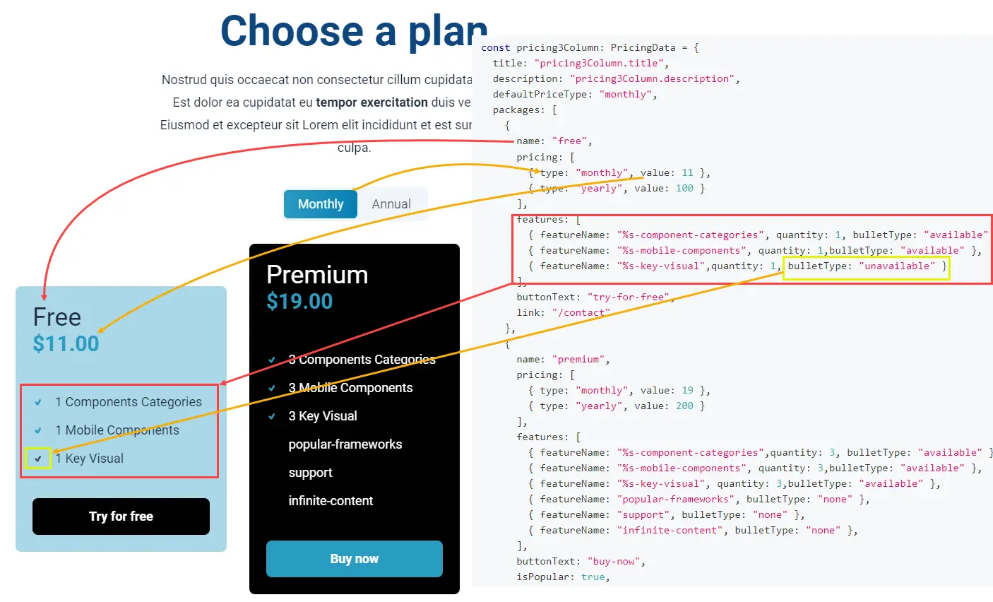
export const pricing3Column: PricingData = {
  title: "pricing3Column.title",
  description: "pricing3Column.description",
  defaultPriceType: "monthly",
  packages: [
    {
      name: "free",
      pricing: [
        { type: "monthly", value: 11 },
        { type: "yearly", value: 100 }
      ],
      features: [
        { featureName: "%s-component-categories", quantity: 1, bulletType: "available" },
        { featureName: "%s-mobile-components", quantity: 1,bulletType: "available" },
        { featureName: "%s-key-visual",quantity: 1, bulletType: "unavailable" }
      ],
      buttonText: "try-for-free",
      link: "/contact"
    },
    {
      name: "premium",
      pricing: [
        { type: "monthly", value: 19 },
        { type: "yearly", value: 200 }
      ],
      features: [
        { featureName: "%s-component-categories",quantity: 3, bulletType: "available" },
        { featureName: "%s-mobile-components", quantity: 3,bulletType: "available" },
        { featureName: "%s-key-visual", quantity: 3,bulletType: "available" },
        { featureName: "popular-frameworks", bulletType: "none" },
        { featureName: "support", bulletType: "none" },
        { featureName: "infinite-content", bulletType: "none" },
      ],
      buttonText: "buy-now",
      isPopular: true,
      link: "/contact"
    },
    {
      name: "basic",
      pricing: [
        { type: "monthly", value: 11 },
        { type: "yearly", value: 100 }
      ],
      features: [
        { featureName: "%s-component-categories", quantity: 3, bulletType: "available" },
        { featureName: "%s-mobile-components", quantity: 3, bulletType: "available" },
        { featureName: "%s-key-visual", quantity: 3, bulletType: "none" }
      ],
      buttonText: "buy-now",
      link: "/contact",
      isPopular: false,
    }
  ],
  currencyConversion: {
    "en": {
      ratio: 1,
      rounding: 2
    },
    "vi": {
      ratio: 24_000,
      rounding: -4
    }
  }
}
notes...
Resume
Resume.Experience
Type declaration
type ResumeExperienceProps = {
  resume: ResumeExperience
  langTable: LangTable
}

type ResumeExperience = {
  title: string
  description?: string
  items: {
    logoUrl: string
    jobTitle: string
    companyName: string
    location: string
    contractType: ContractType
    startDate: string
    endDate: string
    description: MarkdownText
  }[]
}

export type ContractType = "full-time" | "part-time" | "freelance"

/**
 * Why don't we set it as `string` type but `MarkdownText = string`
 * That's because we want to indicate that.. we can use markdown text
 * in this field.
 */
export type MarkdownText = string
- Usage
- Data
- Note
- Screenshots
import Resume from "~/components/Resume"

<Resume.Experience
  resume={experiences}
  langTable={resumeLangTable}
/>
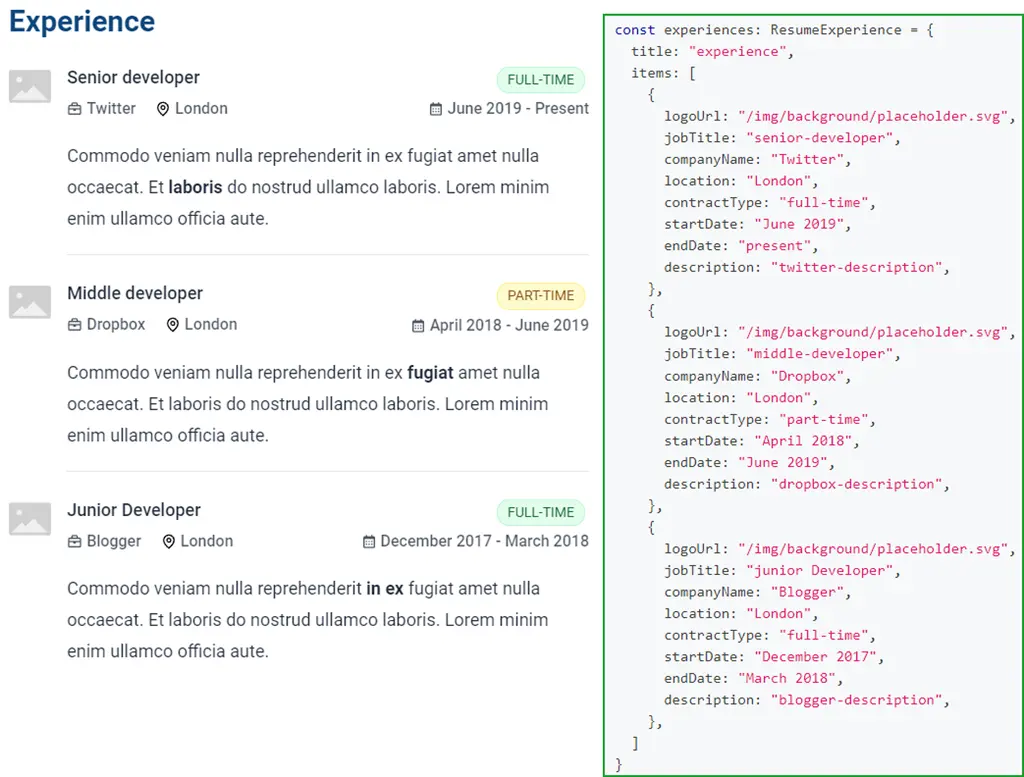
export const experiences: ResumeExperience = {
  title: "experience",
  items: [
    {
      logoUrl: "/img/background/placeholder.svg",
      jobTitle: "senior-developer",
      companyName: "Twitter",
      location: "London",
      contractType: "full-time",
      startDate: "June 2019",
      endDate: "present",
      description: "twitter-description",
    },
    {
      logoUrl: "/img/background/placeholder.svg",
      jobTitle: "middle-developer",
      companyName: "Dropbox",
      location: "London",
      contractType: "part-time",
      startDate: "April 2018",
      endDate: "June 2019",
      description: "dropbox-description",
    },
    {
      logoUrl: "/img/background/placeholder.svg",
      jobTitle: "junior Developer",
      companyName: "Blogger",
      location: "London",
      contractType: "full-time",
      startDate: "December 2017",
      endDate: "March 2018",
      description: "blogger-description",
    },
  ]
}
notes...
Resume.Education
Type declaration
type ResumeEducationProps = {
  resume: ResumeEducation
  langTable: LangTable
}

type ResumeEducation = {
  title: string
  description?: string
  items: {
    logoUrl: string
    major: string
    schoolName: string
    location: string
    startDate: string
    endDate: string
  }[]
}
- Usage
- Data
- Note
- Screenshots
import Resume from "~/components/Resume"

<Resume.Education
  resume={education}
  langTable={resumeLangTable}
/>
export const education: ResumeEducation = {
  title: "education",
  items: [
    {
      logoUrl: "https://logospng.org/download/harvard-university/logo-harvard-university-brasao-256.png",
      major: "master-in-software-engineering",
      schoolName: "brunel-university",
      location: "London",
      startDate: "Sep 2017",
      endDate: "May 2019",
    },
    {
      logoUrl: "https://logospng.org/download/harvard-university/logo-harvard-university-brasao-256.png",
      major: "master-in-software-engineering",
      schoolName: "brunel-university",
      location: "London",
      startDate: "Sep 2013",
      endDate: "May 2017",
    }
  ]
}
notes...

Slider
Type declaration
type SliderProps = {
  images: ImgSrcSet[]
  autoPlay?: boolean
  showThumbs?: boolean
  alignment?: "left" | "right" | "expanded"
}

type ImgSrcSet = {
  mobile: string
  desktop?: string
  description?: string
}
- Usage
- Data
- Note
import Slider from "~/components/Slider"

<Slider
  alignment="expanded"
  images={mySlides}
/>
export const mySlides = [
  {
    mobile: "/img/background/placeholder.svg",
    description: "image 1"
  },
  {
    mobile: "/img/background/placeholder.svg",
    description: "image 2"
  },
  {
    mobile: "/img/background/placeholder.svg",
    description: "image 2"
  },
  {
    mobile: "/img/background/placeholder.svg",
    description: "image 2"
  }
]
Slider could be full width or you can align it to the left or right.
<Slider
  alignment="right"
  images={mySlides}
/>
<Slider
  alignment="left"
  images={mySlides}
/>
Testimonials
Type declaration
type TestimonialsProps = {
  testimonials: TestimonialsGroup,
  langTable: LangTable
}

type TestimonialsGroup = {
  title?: string
  description?: string
  testimonials: TestimonialItem[]
}

type TestimonialItem = {
  name: string
  title: string
  imageUrl?: string
  content: MarkdownText
}
- Usage
- Data
- Note
- Screenshots
import Testimonials from "~/components/Testimonials"

<Testimonials
  testimonials={testimonials}
  langTable={testimonialsLangTable}
/>
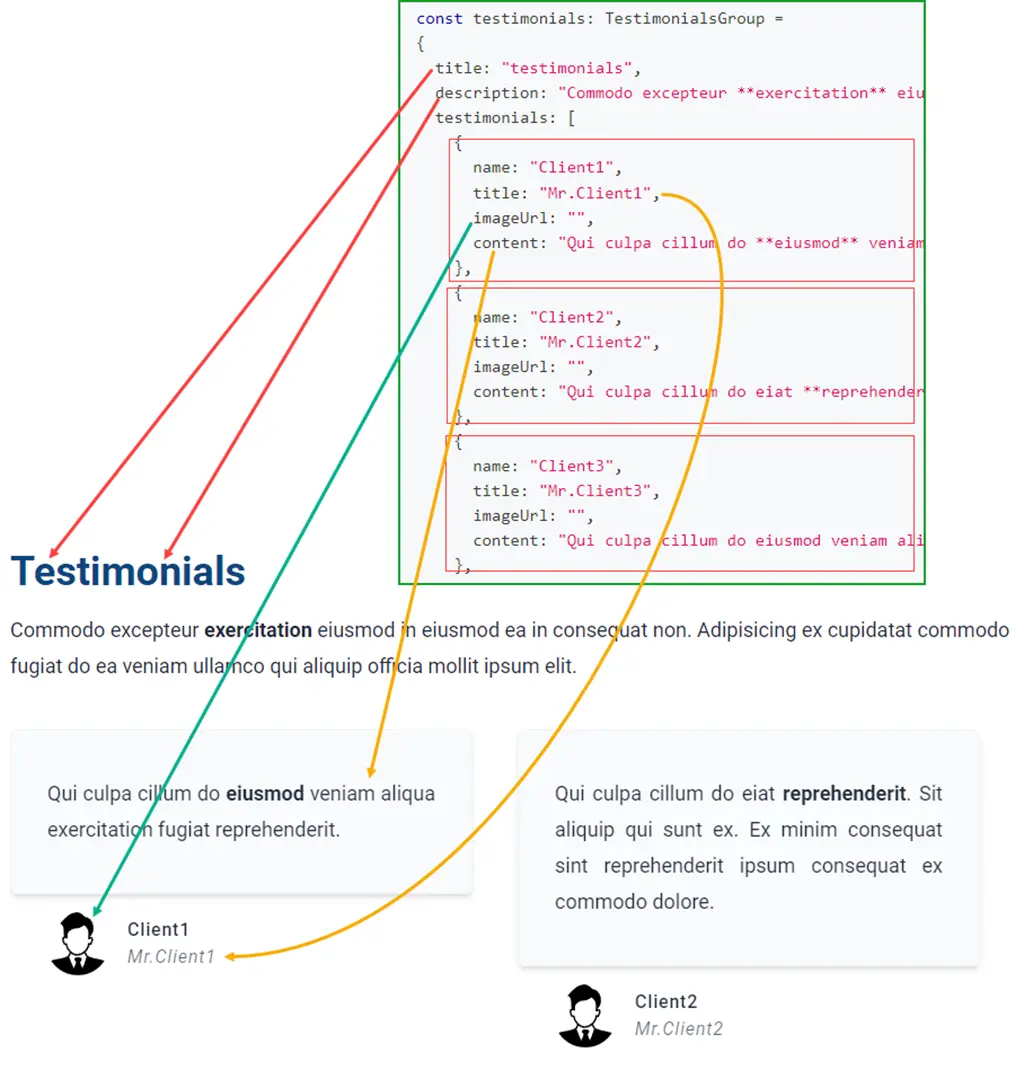
export const testimonials: TestimonialsGroup =
{
  title: "testimonials",
  description: "Commodo excepteur **exercitation** eiusmod in eiusmod ea in consequat non. Adipisicing ex cupidatat commodo fugiat do ea veniam ullamco qui aliquip officia mollit ipsum elit.",
  testimonials: [
    {
      name: "Client1",
      title: "Mr.Client1",
      imageUrl: "",
      content: "Qui culpa cillum do **eiusmod** veniam aliqua exercitation fugiat reprehenderit."
    },
    {
      name: "Client2",
      title: "Mr.Client2",
      imageUrl: "",
      content: "Qui culpa cillum do eiat **reprehenderit**. Sit aliquip qui sunt ex. Ex minim consequat sint reprehenderit ipsum consequat ex commodo dolore."
    },
    {
      name: "Client3",
      title: "Mr.Client3",
      imageUrl: "",
      content: "Qui culpa cillum do eiusmod veniam aliqua exercitation **fugiat reprehenderit**. Sit aliquip qui sunt ex. Ex minim consequat sint reprehenderit ipsum consequat ex commodo dolore."
    },
    {
      name: "Client4",
      title: "Mr.Client4",
      imageUrl: "",
      content: "Qui culpa cillum do eiusmod veniam aliqua exercitation **fugiat reprehenderit**. Sit aliquip qui sunt ex. Ex minim consequat sint reprehenderit ipsum consequat ex commodo dolore."
    },
    {
      name: "Client5",
      title: "Mr.Client5",
      imageUrl: "",
      content: "Qui culpa cillum do eiusmod veniam aliqua exercitation **fugiat reprehenderit**. Sit aliquip qui sunt ex. Ex minim consequat sint reprehenderit ipsum consequat ex commodo dolore."
    }
  ]
}
notes...
Translate
Type declaration
type TranslateProps = {
  lang: Language
  children: React.ReactNode
}
- Usage
- Note
//this block only display when current selected language is `en`
<Translate lang="en">
  Hello world
</Translate>

//this block only display when current selected language is `vi`
<Translate lang="vi">
  Xin chào!
</Translate>
lang is type of Language which is defined at ~/data/settings/config.ts
...
export type Language = "en" | "vi"
export const SUPPORTED_LANGUAGES: Language[] = ["en", "vi"]
export const DEFAULT_LANGUAGE: Language = "en"
export const CURRENCY: Record<Language, string> = {
  "en": "USD",
  "vi": "VND"
}
...
Video
Video.Youtube
Embed youtube video.
Type declaration
type VideoYoutubeProps = {
  /**
   * `id` of the video or playlist
   * eg: https://www.youtube.com/watch?v=8kV8KVWZYaw&list=PLCzpHpwST0xx8IxDzF82Va_rhIEcpbgW5
   *   you can use `8kV8KVWZYaw` or `PLCzpHpwST0xx8IxDzF82Va_rhIEcpbgW5`
   */
  id: string
  params?: string
  /**
   * `id` of any video within the playlist, to get the cover
   */
  playlistCoverId?: string
  /**
   * title of the video
   */
  title: string
  alignment?: "left" | "right" | "expanded"
}
- Usage
- Note
- Screenshots
import Video from "~/components/Video"

<Video.Youtube
  id="PLCzpHpwST0xx8IxDzF82Va_rhIEcpbgW5"
  playlistCoverId="F90ozD7peX0"
  title="Phương Ý"
  alignment="expanded"
/>
notes...
Video.Local
Play your local video files.
Type declaration
type VideoLocalProps = {
    src: string
    autoPlay?: boolean
    loop?: boolean
    muted?: boolean
    aspectRatio?: string
    className?: string
}
- Usage
- Note
import Video from "~/components/Video"

<Video.Local
  src="video.mp4"
  autoPlay
  loop
/>
The default aspect-ratio is 16 / 9.